SlowBound
DELIVERABLES
Creative Direction
Brand Identity Design
Logo Animation
Collateral Design
Social Media Graphics
ABOUT
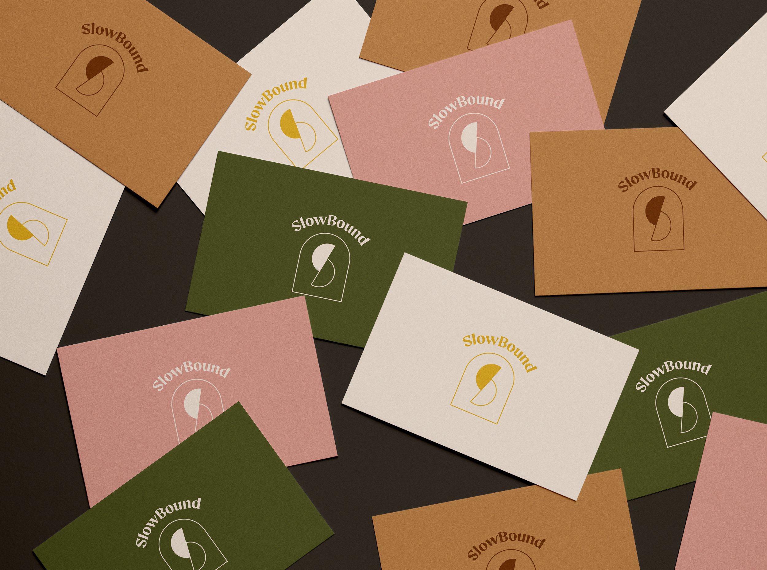
SlowBound was created with the intention of promoting self-care and remind the workaholics to slow down from all the noise. Our objective was to create a timeless, gender neutral brand identity that embodies self care and slow movement. Semi-circles are used in the logo to symbolize healing, consciousness, and awareness, and also form an “S” to represent the brand name, SlowBound. Ultimately, we were able to build a mini brand guide to assist with the overall direction of the packaging and website.


